Main Window - SPEDAS GUI: Difference between revisions
No edit summary |
|||
| (4 intermediate revisions by the same user not shown) | |||
| Line 1: | Line 1: | ||
[[File:Main_window1.png| | [[File:Main_window1.png|400px|right|Main Window]] | ||
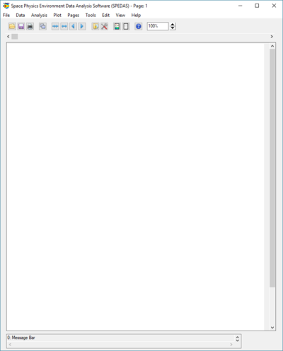
The main GUI window is shown in the figure on the right. This is a snapshot of the window when the GUI is first started. Since no data or SPEDAS GUI document has been loaded and no plots created, the main graph area will be blank. | The main GUI window is shown in the figure on the right. This is a snapshot of the window when the GUI is first started. Since no data or SPEDAS GUI document has been loaded and no plots created, the main graph area will be blank. | ||
The main window contains commonly used menus including [[File_Menu_-_SPEDAS_GUI|File]], [[Edit_Menu_-_SPEDAS_GUI|Edit]], [[View_Menu_-_SPEDAS_GUI|View]], and Help. Pull down menus specific to SPEDAS are [[Data_Menu_-_SPEDAS_GUI|Data]], [[Analysis_Menu_-_SPEDAS_GUI|Analysis]], [[Graph_Menu_-_SPEDAS_GUI|Plot]], [[Tools_Menu_-_SPEDAS_GUI|Tools]], [[Page_Menu_-_SPEDAS_GUI|Pages]]. | The main window contains commonly used menus including [[File_Menu_-_SPEDAS_GUI|File]], [[Edit_Menu_-_SPEDAS_GUI|Edit]], [[View_Menu_-_SPEDAS_GUI|View]], and [[Help_Menu_-_SPEDAS_GUI|Help]]. Pull down menus specific to SPEDAS are [[Data_Menu_-_SPEDAS_GUI|Data]], [[Analysis_Menu_-_SPEDAS_GUI|Analysis]], [[Graph_Menu_-_SPEDAS_GUI|Plot]], [[Tools_Menu_-_SPEDAS_GUI|Tools]], [[Page_Menu_-_SPEDAS_GUI|Pages]]. | ||
The toolbar is the menu below the main pull down menus. For quick and easy access to the most frequently used functions, the toolbar contains icon buttons the user can click on instead of navigating through the pull down menu hierarchy. All icon buttons in the toolbar contain tooltips to provide the user with a brief description of the functionality. | The toolbar is the menu below the main pull down menus. For quick and easy access to the most frequently used functions, the toolbar contains icon buttons the user can click on instead of navigating through the pull down menu hierarchy. All icon buttons in the toolbar contain tooltips to provide the user with a brief description of the functionality. | ||
| Line 35: | Line 35: | ||
== Graph Area == | == Graph Area == | ||
[[File:Main_window_graph_area.png| | [[File:Main_window_graph_area.png|400px|right|SPEDAS main window with data plotted]] | ||
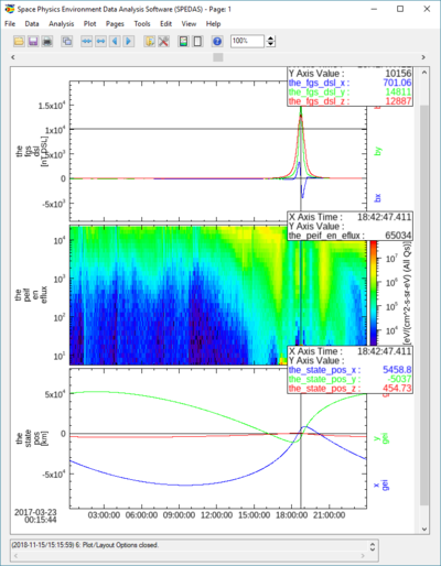
The figure to the right shows an example of the main graph area with a graph plotted. | The figure to the right shows an example of the main graph area with a graph plotted. | ||
== Status Bar == | == Status Bar == | ||
Latest revision as of 23:18, 15 November 2018

The main GUI window is shown in the figure on the right. This is a snapshot of the window when the GUI is first started. Since no data or SPEDAS GUI document has been loaded and no plots created, the main graph area will be blank.
The main window contains commonly used menus including File, Edit, View, and Help. Pull down menus specific to SPEDAS are Data, Analysis, Plot, Tools, Pages.
The toolbar is the menu below the main pull down menus. For quick and easy access to the most frequently used functions, the toolbar contains icon buttons the user can click on instead of navigating through the pull down menu hierarchy. All icon buttons in the toolbar contain tooltips to provide the user with a brief description of the functionality.
Below the toolbar is the horizontal scroll bar, which allows the user to pan left and right along the x-axis of any displayed data.
The large central area of the main window contains the graph area and is where plots are displayed. To the right of the graph area is a scroll bar that allows the user to scroll vertically when multiple plots are displayed. Unlike the horizontal scroll bar, this scrolls across the images, but doesn't change the range of displayed data. If the view is zoomed in sufficiently, a scroll bar will also appear on the bottom of the graph area; which, like the vertical scroll bar, will allow scrolling across the displayed plots, but not change the range of the displayed data.
And, finally, at the bottom of the window is a message bar. The message bar updates the user on the state of the GUI, the status of an operation, and provides general information to the user, including warning and/or error messages.
Pull Down Menus
Pull down menus use standard features that users are familiar with and including the following:
Sensitive: A menu item may be sensitized or desensitized (grayed out) depending on the state of the GUI and/or the availability of an operation at the time it is requested
Checked: Check marked menu items are used when an option can be turned on or off. The check mark allows the user to toggle on or off an item.
Sub-menu: In cases where multiple options are available, a sub menu is used to further divide the functionality. Sub menus will have a carrot or arrow head indicating there are additional options to select from.
Dynamic: One menu, the Page menu, is not static and changes with the number of pages that have been created.
Pop-Up: In cases where a menu item displays another window, the name of the item will be following by three periods.
Accelerator: Some menus have accelerator keys associated with them. Accelerator keys provide a quick and easy way to invoke functions. When a menu item has an accelerator key, the key combination will be listed next to the name of the menu item.
An example pull down menu is shown in the figure below.
Toolbar Icons
The toolbar provides shortcuts to more commonly used functions. The buttons contain familiar icons depicting the operation. In addition, each tool bar button contains a tool tip that is displayed when the cursor hovers over the button. The tool tip displays text describing the function of the button. The figure below shows the tool bar.

Graph Area

The figure to the right shows an example of the main graph area with a graph plotted.
Status Bar
The status bar is located below the main graph area and displays messages to the user. Messages include status updates, state of the GUI and/or operation, success and failure notices, as well as warning and error information. It is important for the user to remember to check the status bar periodically for messages, particularly if you think something is not correct. Information displayed in this bar may be helpful and provide an answer to your question.
Please note, when a severe error or incorrect usage occur you will be notified via a pop-up dialog window explaining the error. Additional instructions may be provided.
Buttons
In order to provide a consistent interface throughout the GUI, you will find most windows contain the set of buttons shown in the figure below.

OK: When this button is clicked whatever changes you made since the window was first displayed will be made, committed within the system. The window will be closed and the main graph area will be updated to reflect the changes. Please note that when OK is selected the original settings will be lost.
Apply: The apply button will update the main graph area so that you can view your changes. The window will not be closed and your changes will not be committed.
Cancel: Whenever the cancel button is clicked all changes made since the window was first invoked will be reset to original settings. The window will be closed. The main graph area will be updated to reflect its original state. You should note that like the OK button, when the cancel button is selected all changes are lost permanently.
Windows
A window within the GUI refers to any window that is opened when pull down selections are made, a tool bar button is clicked and other user interactions. Windows have frames, titles, as well as minimize, maximize, and close buttons within the frame. Most windows are also modal. That is, the user must either click the OK or Close button, or the Cancel button ‘X’ in the window frame before control is returned to the calling or original window.
NOTE: Screen size and system settings vary from machine to machine. During testing, a rare case was found that opened some IDL windows to size zero. The windows included the dialog box pick file and printer setup used in the File pull down menu. This is an error internal to IDL. If a window opens to size zero, you simply need to resize to see the content.
Pages
The user can have one or many pages during a session. A page contains one or many panels, titles, background color, etc. The number of pages that have been created can be determined by using the Page pull down menu. The Page pull down menu also provides a way for the user to toggle between pages since only one page can be displayed at a time.
Panels
A panel is a plot or graph on a page. Panels are usually contained within an axis frame and have x and y axes (and z axes for spectral data), traces, ticks, gridlines, and other features. One or many panels can be created per page.
Color Palette
Most of the Graph Options windows allow the user to change the color of labels, traces, background, grid, annotations, and more. Whenever color can be modified, a Color Button (with a color palette icon) and Color Swatch with the current color setting will be available. An example of the Color Button and Current Color Swatch are shown in the figure below.
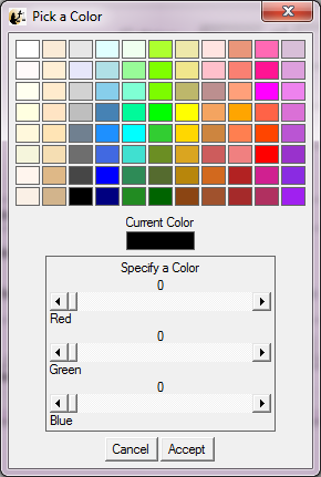
When the color button is clicked a Color Palette window is displayed. The user can select a color by clicking on the color tiles or by using the RGB slider bars below the tiles. When a selection has been made the current color swatch in the middle of the window will be updated to reflect the new color. You can choose to accept the color by clicking on the Accept button or choose not to make any changes by clicking on the Cancel button. Both the Cancel and Accept buttons will close the color palette window and return to the original or calling window. If the user accepted the color, the current color swatch in the original window will be updated. The color palette window is shown in the figure below.

The Color Palette window is a modal window and you must either make a selection or cancel the window in order to return control to the calling window.
Data Tree
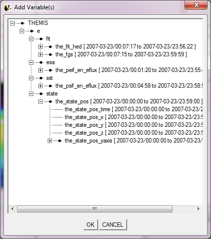
All data that have been loaded directly into the GUI or imported from tplot variables are displayed in a tree widget. Many of the GUI windows require the user to select data for analysis or plotting and will be displayed in tree format. The tree widget allows the user to expand or collapse the tree by clicking on the ‘+’ (expand) or ‘-‘ (collapse) buttons next to the data. The data tree hierarchy is as follows:
Mission Observatory Instrument Data Group Data Components
An example of a data tree is shown in the figure below.
